MITTEA
visual identity | packaging design | art direction
How do you preserve and glocalise Indian tea traditions and integrate them into the urban landscape of London?
FEATURED ON:


THE PROBLEM
The answer wasn't straightforward, because preservation and glocalisation are inherently in tension. MITTEA is a London-based beverage brand built around the glocalisation of the Indian Kulhad, a traditional terracotta cup used across India for centuries. Three conflicts sat at the heart of this brief:
Heritage vs. modernity, ancient and handmade; needed to feel contemporary and scalable
Local vs. global, rooted in Indian culture,
designed for London streets
Tactile vs. digital, a physical, sensory material
that needed to communicate visually
THE PROCESS / THE PROOF
The answer started with the name. Mittea, a wordplay on 'Mitti', the Devanagari for earth or soil, preserved the brand's cultural origin in its very language before a single visual was considered. If the name carried the tradition, everything else could carry the modernity.
The visual identity was built around a minimalist-maximalist philosophy, clean, functional layouts doing the structural work of a contemporary urban brand, rich cultural textures and motifs carrying the emotional weight of centuries of tradition.
The most deliberate decision was translating something tactile, the porosity and warmth of terracotta, into something you can see. Therefore, using textures became a crucial visual metaphor for the brand's physical origins, making the tactile legible to a digital world and the local fluent to a global one.













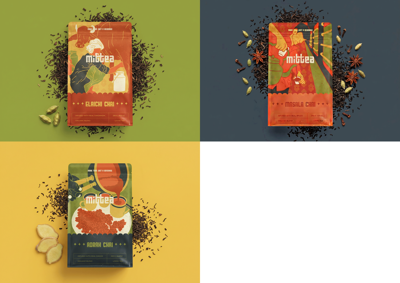
The packaging tells stories. Each design captures a moment from Indian tea culture, the rituals, the settings, and the human warmth surrounding how chai is consumed across India.
The goal wasn't to explain Indian culture to a Western audience. It was to make it feel by anyone and everyone, without diluting what made it worth preserving in the first place.